Products
Solutions
Resources
9977 N 90th Street, Suite 250 Scottsdale, AZ 85258 | 1-800-637-7496
© 2024 InEight, Inc. All Rights Reserved | Privacy Statement | Terms of Service | Cookie Policy | Do not sell/share my information

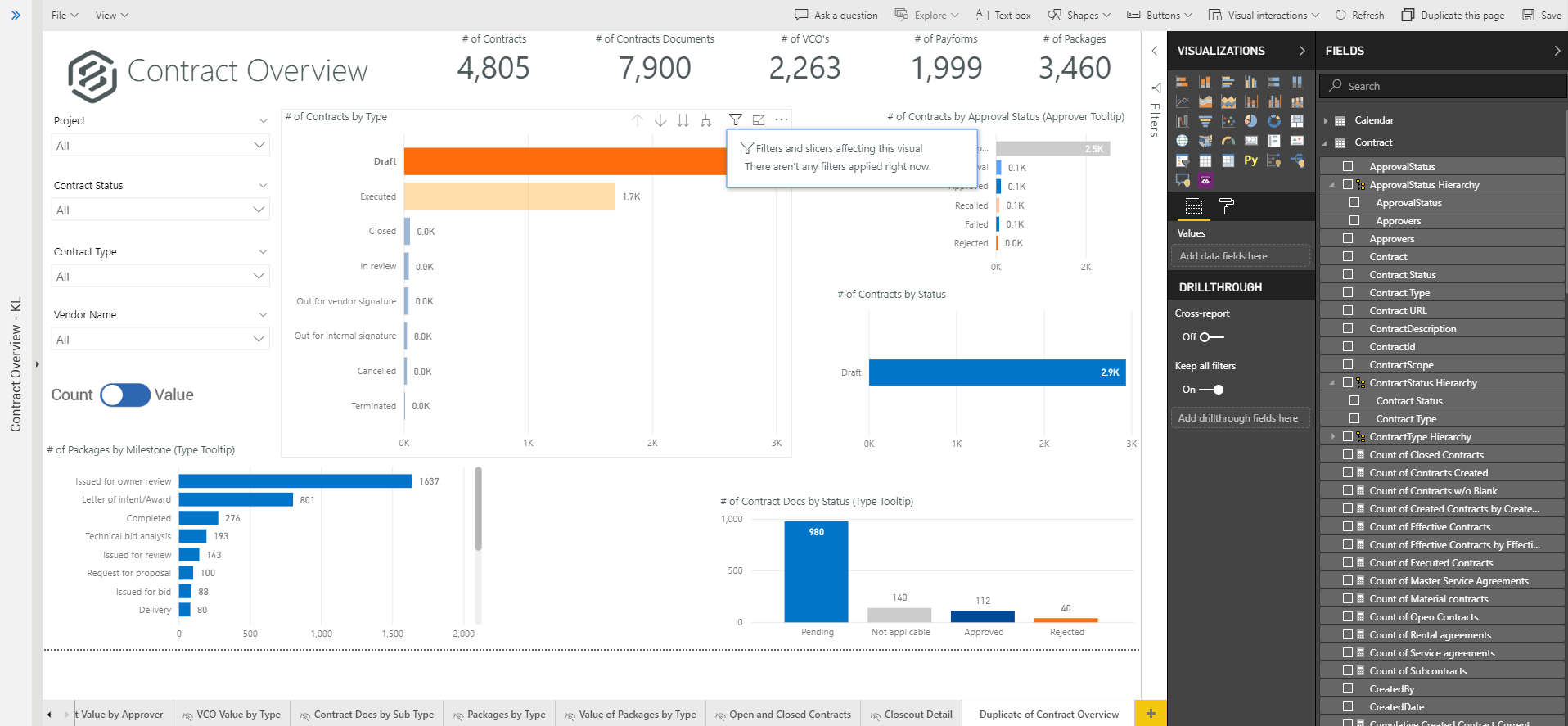
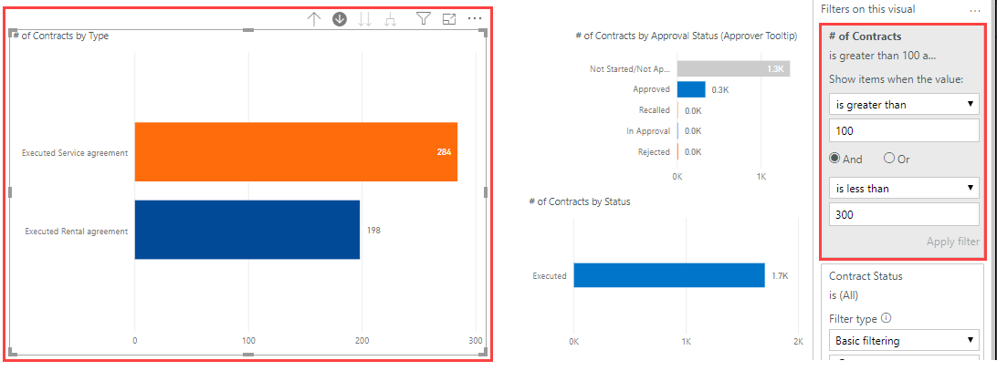
The dashboards in Explore have advanced filtering abilities to make viewing easier and more customized.
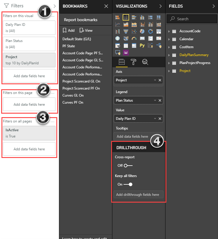
You can filter the information on your dashboards on four different levels:
| Filter | Definition |
|---|---|
|
Visual Level |
Filters a single visual on a dashboard. You can select the date range, account codes, approvers, etc. that you want shown. |
|
Page Level |
Filters all the visuals on a single page. You can use this to filter by areas on the project, date range, executor, etc. |
|
Report Level |
Filters all pages in a report. You can use this to filter a report by project, date range, remaining MHrs, etc. |
|
Drillthrough |
Used to focus on one aspect of the project. Any other page or visual that contains this drillthrough value can be redirected to this drillthrough page for a more focused and up-close view. |
Drilling down on report data to the meta-data level, can assist in your analysis. Most of the visualizations on the dashboards display data at a summary level. Drilling down into the visualizations allows you to see the data at the detail level.
To enable us to view filtering and drill down data better, complete these preliminary steps.
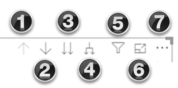
| # | Filtering Option |
|---|---|
| 1 |
Drill Up |
| 2 |
Drill Down |
| 3 | Go to Next Level in the Hierarchy |
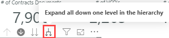
| 4 | Expand all Down one level in the Hierarchy |
| 5 | Filter |
| 6 | Focus Mode |
| 7 | More Options |
Navigate to the dashboard that you just created and select Edit dashboard from the Context menu icon.

Note the four types of filters:
| Filter Type | Definition |
|---|---|
|
Filters on an individual visual. |
|
Filters on every visual on the report page. |
|
Filters on all pages in the report. |
|
Filters on a single entity in the report. |
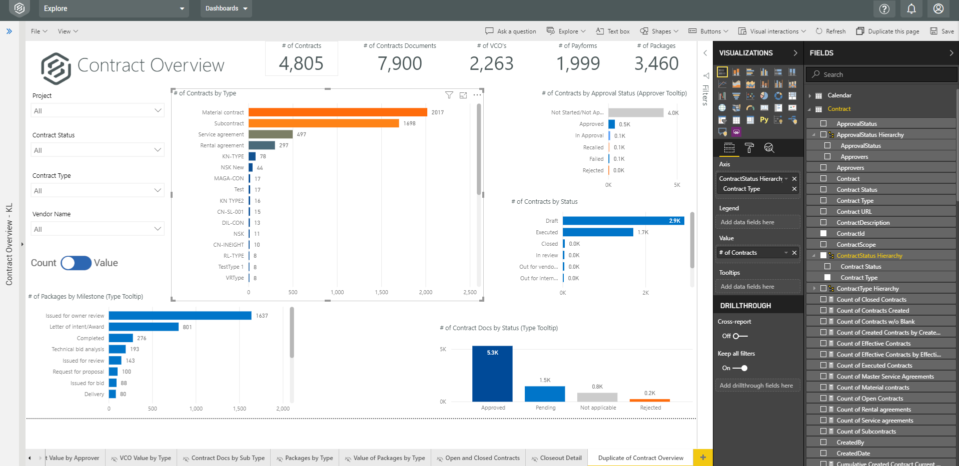
Having followed the previous steps, your screen should now look similar to this:
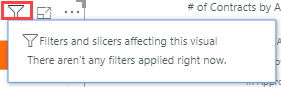

![]()

![]()
Two options of page filtering exist in Explore. The first is filtering on just this page (tab.)
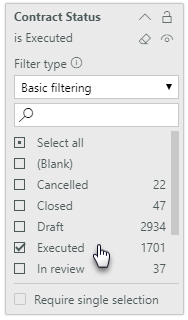
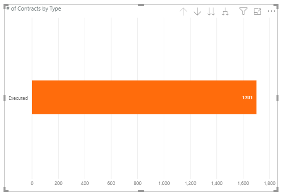
From the Contract Fields panel, drag the checked Contract Status field onto Filters on this Page.
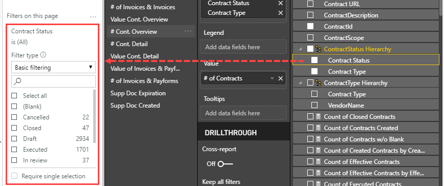
Select Closed from the Basic Filtering drop-down list.
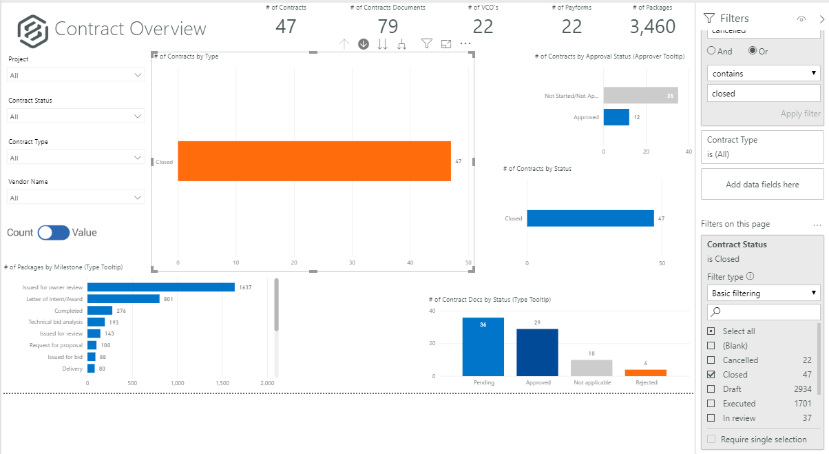
Select the Remove Filter X icon.
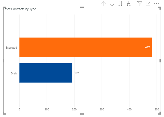
The second type of page filter applies a filter across all pages (tabs).
Drag the same Contract > Contract Status data field onto Filters On All Pages.
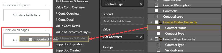
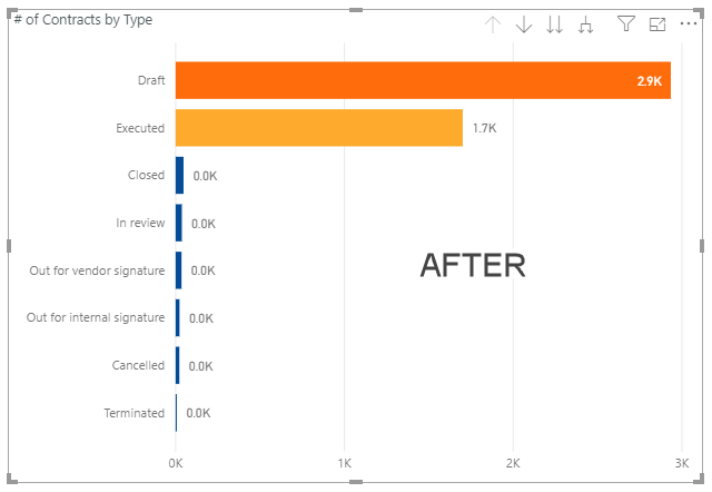
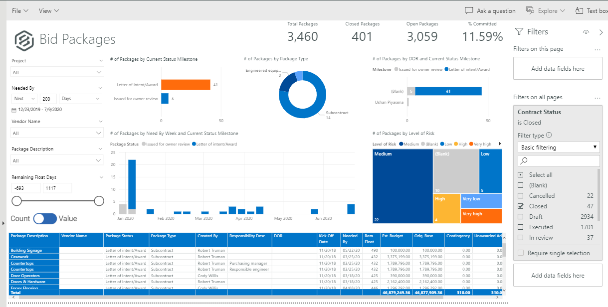
Again choose the option of Closed from the drop-down list. Nothing will look different on this tab, only when you select another tab will the change be obvious. For example, this is the Bid Packages tab, where all charts only represent Closed projects.
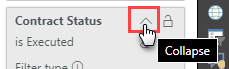
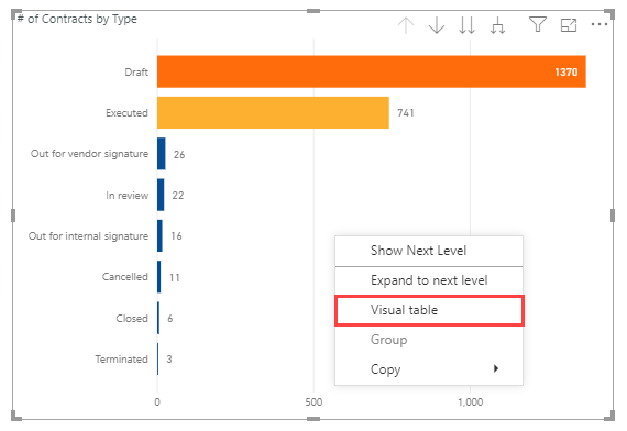
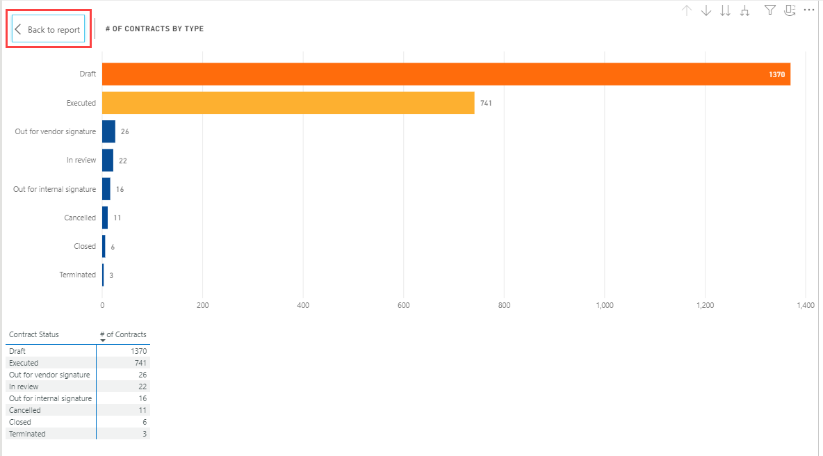
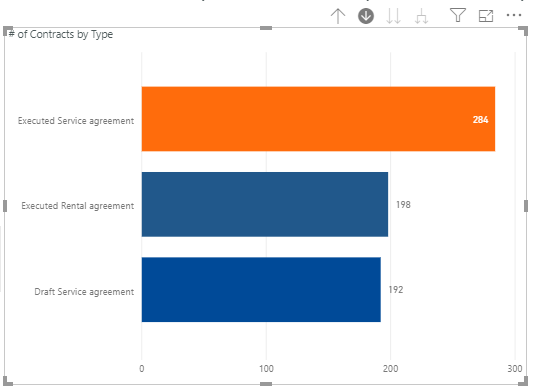
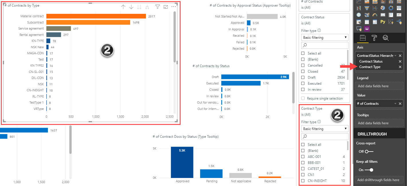
The final icon when filtering is the Go to Next level in the Hierarchy icon. When in a report and this icon is clicked, the table filters down to the next level in the Hierarchy as shown in this Visualization:
Initially, data will be represented by Contract Status.
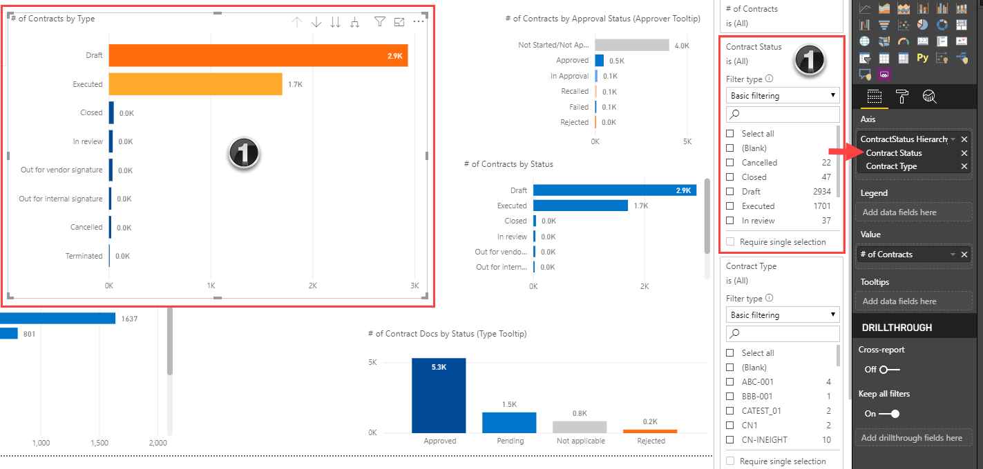
When the Go to Next level in the Hierarchy icon is selected, the chart will change to # of Contracts by Contract Type.
Throughout the Explore dashboard, there are multiple instances where you can hover over a data-point to obtain a Type Tooltip pop-up showing drill down data.
Last Data Refresh: A time-stamp in the dashboard list indicates when the data in that dashboard was last refreshed. This helps minimize the confusion about why some records may or may not be present in your dashboard.
Additional Information
9977 N 90th Street, Suite 250 Scottsdale, AZ 85258 | 1-800-637-7496
© 2024 InEight, Inc. All Rights Reserved | Privacy Statement | Terms of Service | Cookie Policy | Do not sell/share my information