Products
Solutions
Resources
9977 N 90th Street, Suite 250 Scottsdale, AZ 85258 | 1-800-637-7496
© 2024 InEight, Inc. All Rights Reserved | Privacy Statement | Terms of Service | Cookie Policy | Do not sell/share my information

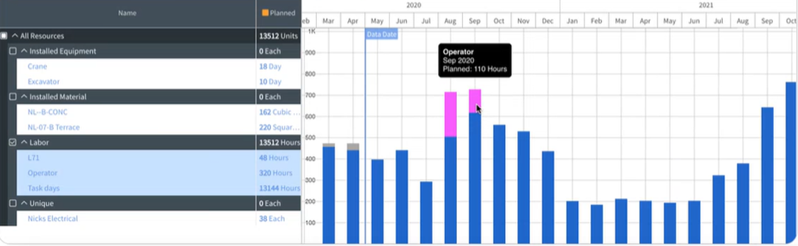
The Stacked Histogram shows the different resources in the histogram using different colors. Hover over the different colored tool tips to show which resource that color represents. The tool tip also gives you data for the specific resource and period.
The Stacked Histogram contains advanced filtering capabilities, letting you click on a specific colored bars in a specific time period. Schedule then builds a filter to show that resource for that time period in the Gantt chart.
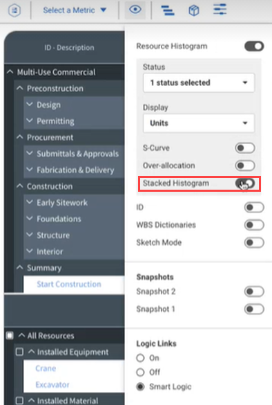
Use the following step by step to enable the Stacked Histogram.
In the toolbar, click the View options icon.
With Resource Histogram enabled, switch the Stacked Histogram toggle on.
Stacked Histograms are shown on the histogram.
Hover over the different colored bars to show the tool tip information.
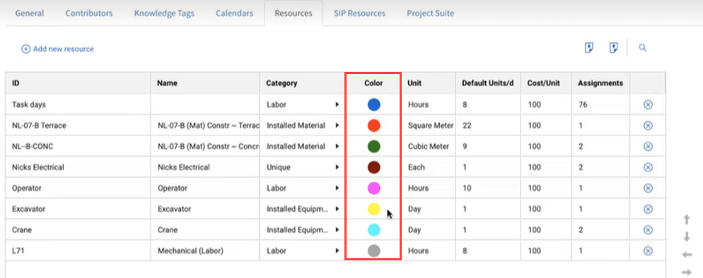
Similar to the color column in the SIP resources, the Stacked Histogram colors are controlled at a project level in the Project Configuration.
Use the following step by step to edit the column colors for the stacked histogram.
Select the navigation drop-down menu.
Select Schedule Configuration.
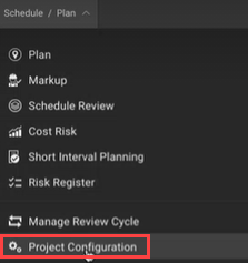
Select the Resources tab.
Resources that have been added to the Resources tab have a column labeled Color.
Select the color cell in the row of the resource you want to edit. Then choose a different color for that resource.
Additional Information
9977 N 90th Street, Suite 250 Scottsdale, AZ 85258 | 1-800-637-7496
© 2024 InEight, Inc. All Rights Reserved | Privacy Statement | Terms of Service | Cookie Policy | Do not sell/share my information